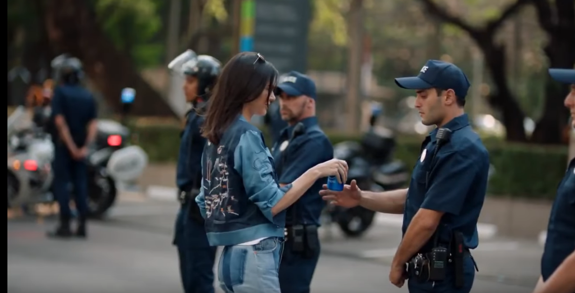
 In early April, 2017, Pepsi debuted a new 2:30 long advertisement online. This ad featured superstar Kendall Jenner, and aimed to hit home with a younger generation in the midst of a tense time in our world and especially the US. The ad starts out well, and seems to be heading in a good direction, but this is all ruined by a scene at the end where Kendall hands a Pepsi to a police officer to “ease tensions” between the officers and the crowd. This sounds innocuous enough, but unfortunately for Pepsi they missed the mark entirely, resulting in major backlash so bad that the ad was pulled from all media platforms and it became infamous as one of worst PR blunders in recent history. So what was so bad about this ad anyway?
2 Comments
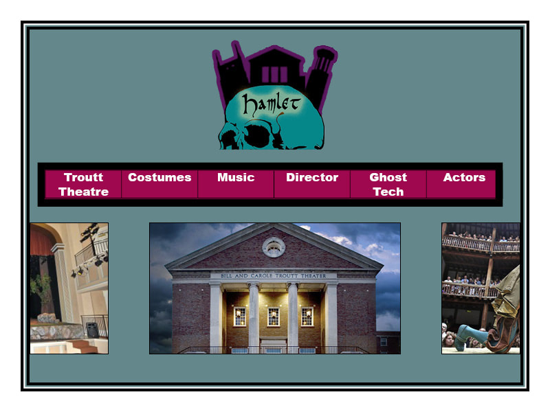 Because Hamlet is such a widely-done play, and there’s bound to be many archives on the internet, I tried to emphasize in my design the significant elements of this specific performance that makes it different from the rest. This mainly shows in my logo, that represents Nashville with a silhouette of the iconic AT&T building, Belmont and its students (this digital literacies class) with the clock tower, and the Troutt theater with a silhouette of itself. Because of the logo’s size and alignment at the top of the page, it’s one of the first things someone should see when going to the website. This emphasizes the importance of the city and the university to this specific performance of Hamlet, so the site visitor knows what the content of the site is going to be based around. The stroke outside of the buildings is violet to contrast from the background and skull, and the colors are all jewel colors to match the feel of the play. There is also nothing horizontally to it on either side, so that it’s the only thing that can be seen at the top of the page. As for the nav bar, I decided to make it red to contrast from the background, and placed it below the logo as it’s the next most important thing on the site. This navbar outlines the sites content in an organized, simple way, and makes navigating as easy as possible. Ideally the words are more centered vertically, but I wasn’t able to figure this out in Indesign. Finally, under the nav bar is a slideshow with pictures of interest relating to each page. These all link to each of the sites in the nav bar, and exist to provide a more stimulating home page. Along with potentially having short explanations of each page that appear when hovering over one of these images, this provides an alternate way to browse the website, and can help convince people to check out more of the site’s content. Alternatively, this slideshow can be of videos or just interesting images, however it must be visually stimulating. Since we won't have too much content on this site, I think that a simplistic design is the best route. The entire site should be navigable from the home page, and the user should not be overwhelmed.
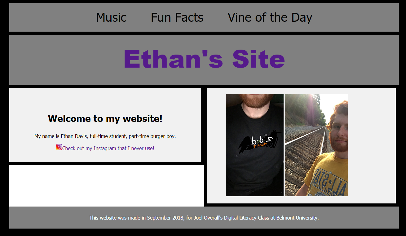
Technical – To make my site, I first used a template from w3schools, and then changed pretty much everything but the basic layout. As for my successes, I think that some of the basic elements (colors, links, text) were very easy to put together. All of these were relatively self-explanatory, and didn’t require more than just referencing the tutorial site to figure them out. One thing I did have to look up how to do, was to make links a different style from default, as well as adding the hover option. This did give me some trouble as the default formatting for links has to be manually disabled, but this didn’t take too long. As for challenges though, alignment and images were something that I had trouble with, and the final product reflects this. I spent hours trying to figure out how to keep elements from moving when changing the window size, as well as trying to keep the footer stuck to the bottom and images where I wanted them to be, but nothing I tried or looked up seemed to work. When I first started making my website there wasn’t much of an issue with these, but the more things I added just made the site harder to align.
The Ideal Website – I was hoping for something similar to the final result, just with a bit more content, a more professional look, and coding that isn’t bad. I think that the layout and colors were a good start, but I didn’t know what to put on the website, text and image-wise, and my lack of coding skills made it really hard to realize my goal of a nice, sleek-looking design. If I had more coding knowledge, I would fix the alignment first, then add more colors and images to the site to make it look prettier. Modes – For this site, I mainly used visual, linguistic, and spatial modes. For these, I wanted to give my site more of a lighthearted feel to match the humorous side of my personality. The images were supposed to be silly, and the content wasn’t meant to be taken too seriously. I was mainly just trying to represent my personality the best way I could through these modes. As for spatial, I was trying to create a design that isn’t intimidating, but also shows the majority of the site’s content at once. The nav bar at the top was key in doing this, and the large image sizes and spacing gave the pages a much fuller feel. Design Strategies – I used contrast in my site’s color scheme. I wanted the links and sections to be noticeably separate from the background, so they would be easy to distinguish. As for emphasis, I made the links at the top of the page really big so they would be hard to miss, while making the current page title the header. This made my site as easy to navigate as possible, and shows the visitor what to click on. For color, I mainly just used a color scheme I liked. I mostly wear dark clothes and think black and white is a nice color combo, so I thought that what I chose would be a good fit for my site. As for organization and alignment, I did the best I could to section out the site into pages that represented entirely different things. I didn’t have too much of a strategy behind this, other than just doing something that made sense and the least-confusing as possible. Finally, for proximity, I purposely put a decent amount of spacing between all of my elements. I figured having too much together would be overwhelming, and spreading info throughout the pages would make for a fuller-looking site. Overall, I’m happy with my site. I almost completely destroyed it a few times out of frustration, and the perfectionist in me can’t be too happy with the result, but it was fun figuring out a lot of things on my own. It's a good start for sure. 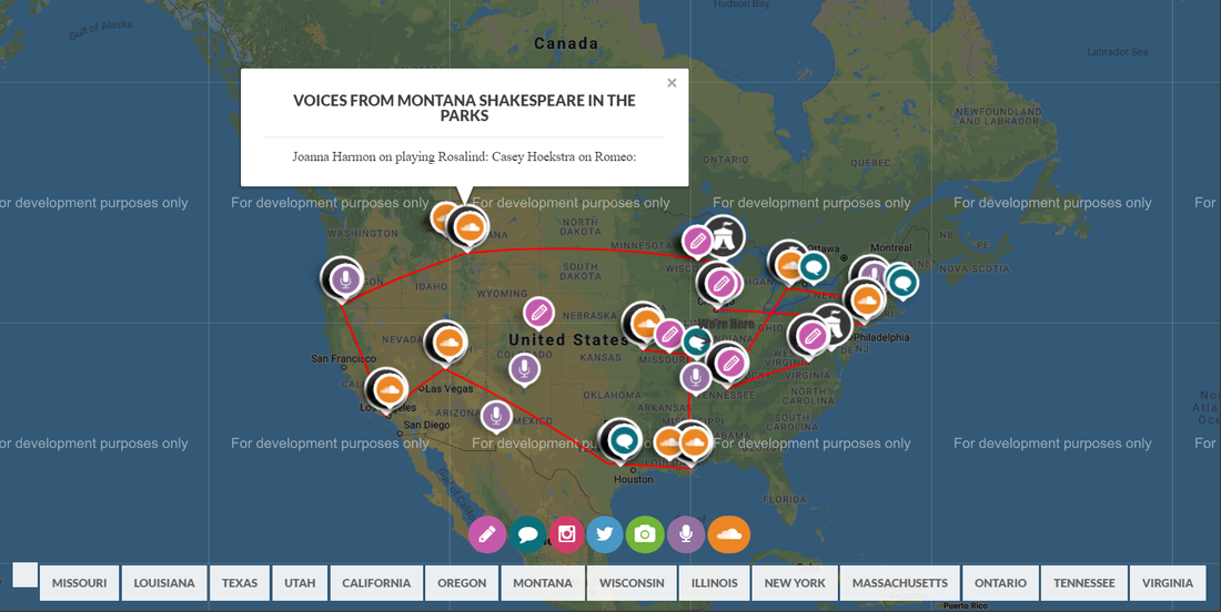 http://shakespeareontheroad.com/
Compared to some of the other Shakespeare archive websites, the website design for Shakespeare on the Road is by far one of the most interesting. Shakespeare on the Road was an ambitious 2014 project where a group of Shakespeare devotees traveled around North America over the course of two moths to perform Shakespeare at 14 different festivals. The website seems to most focus on the cast and crew during the journey, highlighting their experiences and insights gained through performing at so many different festivals. The website also tries to push a rhetoric about the importance of learning and performing Shakespeare, and the design smartly condenses a lot of information into one main page. As for the rhetoric, the audience of the site seems to be directed towards people with an interest in Shakespeare, and specifically those in North America. Before entering the site, the first thing you see on the homepage is “SHAKESPEARE” in big letters. This lets the audience know right away what they’re getting into, with a sleek design and short but effective description of the project. While this site looks nice, however, the context of it isn’t so great. The lack of margins make the site feel way too spacious and open, and combined with the large amount of info at once made it somewhat frustrating and overwhelming to look through. I know that this is to account for people viewing on mobile, but for those of us viewing on computers this isn’t a very appealing design. The pictures they use and the categorical separation of articles make the site visually appealing and somewhat easy to navigate, but overall I found the design to just be way too complex. The interactive map, however, is a great idea. Not only does it provide the route of the road trip at a glance, but it lets the audience have a visualization of when and where the team was at the time something was posted. This provides a ton of context behind each post, and is a genius way to display all of the sites info at once. For our class project, I think we should avoid borrowing too much from this site’s layout, but most of the design choices, especially the map, I think we should try to take some inspiration from. When dealing with a lot of info, trying to come up with a concise, yet visually-appealing way to present it is key. The purpose of this site is clear: the team wants to represent their ambitious journey as best as they can, while also using it as a way to show the importance of learning Shakespeare. On the very first page, at the bottom, this is written, “60 DAYS. 14 FESTIVALS. 10,000 MILES. 38 PRODUCTIONS. HUNDREDS OF INTERVIEWS DISCOVERING WHY SHAKESPEARE MATTERS TO THE PEOPLE OF NORTH AMERICA.” This is essentially an overview of the entire site in 21 words, and is put in a spot that most people visiting the website won’t miss. For our class site, I think some form of tag line or condensed project summary on the first page would be a good idea. This gives whoever’s visiting the site for the first time more of a first impression of what the site represents. While this site design was probably commissioned by a professional, the content is somewhat diverse. There seems to have been a media team on the crew that put this together, but the site contains podcasts from different people, actor insights, photos, and more. This is a promotional site, but the authorship is diverse and genuine. I think that including some more personal content on our site would be a good idea, but not necessary. Finally, the genre of this site could be considered a quasi-blog. The content of the site is very blog-like, and can even be viewed chronologically, but it’s also a promotional site since its purpose is to spread the word about their project and their message. The website coordinators did a great job combining these two genres, and it would be interesting to see if we could incorporate multiple genres in our project. I think that this is a well-done site. There is a noticeable lack of content in some categories, as well, as some visual design flaws, but the overall design captures the ambition and purpose of the project quite well. For our class project, this would be a great site to take inspiration from.  Facebook Server Room. Source: Facebook Curation and building an online presence often go hand-in-hand. Everything online that we post, like, add, etc. is added to a list of other creations or impressions we’ve made in the past. Over time, this turns into a collection of various texts, images, and other media that we can use to help portray ourselves or an idea. Usually, these online curations have some form of a shared theme or unifying idea that creates an aesthetic. While I don’t have much of an online “presence,” if someone were to comb through my various accounts (please don't do this) they could probably get a really good idea about me as a person.
Spotify is easily the most-used of my online accounts. While I don’t usually go out of my way to share music I’m listening to, creating public playlists is a nice way to keep track of music I like while also using the app as a form of expression. I believe that the kind of music we listen to can say a lot about who we are and what we’re currently going through, and I like viewing playlists as preservations of different emotional phases in our lives. Spotify’s discovery feature also plays a role in how I curate my playlists. This can be very hit or miss, but nonetheless I’ve found this technology to be useful on multiple occasions for filling my musical library with a lot more diversity. If someone were to look at my created playlists, which I do make public, I think that it would reveal as much about me as other social medias do. I don’t use Spotify intentionally as a social media platform, but in some ways it can serve a similar purpose as one. As for actual social media platforms, I use Twitter and Facebook very differently. Twitter isn’t something I use seriously much at all. I mostly just use it as an outlet for random things I think of, as well as retweeting things that either have interest to me or match my style of humor. To sum it up, I’d describe it as a collection of my various thoughts and amusements and not much more than that. Facebook, on the other hand, I treat much more formally and, when I actually use it (which admittedly hasn’t been in multiple years), I treat it as a collection of important events in my life. My Facebook is pretty much entirely just things my mom has posted to my page, but whenever I decide to use it again I still planning on posting just important stuff. If I have a birthday or graduate college, it goes on Facebook. If it’s 1 am and I just thought of the best joke, to Twitter I go! Besides the difference in content, I also treat both platforms very differently in terms of how much I reveal about myself. Since Facebook is viewed as more of a “professional” platform, I include my full name, college, and job in my bio. Twitter, on the other hand, shows a much different side of me that the professional world probably doesn’t need to see, so I keep a lot of info about myself minimal. All-in-all, Facebook is a curation of facts about me, but Twitter is a curation of bits of my personality. I’ll admit that I find the amount of info about me that I’ve created on the internet a little unsettling, but I also understand that it’s just part of living in the digital age. Almost everything we do online, intentionally or not, adds to our online presence. |
AuthorWrite something about yourself. No need to be fancy, just an overview. Archives
October 2018
Categories |
||
 RSS Feed
