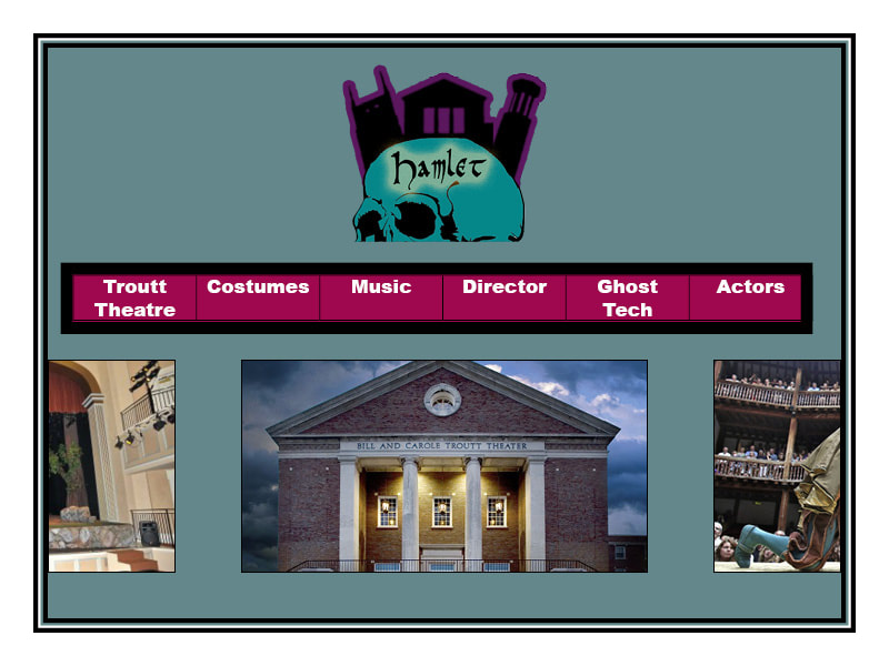
 Because Hamlet is such a widely-done play, and there’s bound to be many archives on the internet, I tried to emphasize in my design the significant elements of this specific performance that makes it different from the rest. This mainly shows in my logo, that represents Nashville with a silhouette of the iconic AT&T building, Belmont and its students (this digital literacies class) with the clock tower, and the Troutt theater with a silhouette of itself. Because of the logo’s size and alignment at the top of the page, it’s one of the first things someone should see when going to the website. This emphasizes the importance of the city and the university to this specific performance of Hamlet, so the site visitor knows what the content of the site is going to be based around. The stroke outside of the buildings is violet to contrast from the background and skull, and the colors are all jewel colors to match the feel of the play. There is also nothing horizontally to it on either side, so that it’s the only thing that can be seen at the top of the page. As for the nav bar, I decided to make it red to contrast from the background, and placed it below the logo as it’s the next most important thing on the site. This navbar outlines the sites content in an organized, simple way, and makes navigating as easy as possible. Ideally the words are more centered vertically, but I wasn’t able to figure this out in Indesign. Finally, under the nav bar is a slideshow with pictures of interest relating to each page. These all link to each of the sites in the nav bar, and exist to provide a more stimulating home page. Along with potentially having short explanations of each page that appear when hovering over one of these images, this provides an alternate way to browse the website, and can help convince people to check out more of the site’s content. Alternatively, this slideshow can be of videos or just interesting images, however it must be visually stimulating. Since we won't have too much content on this site, I think that a simplistic design is the best route. The entire site should be navigable from the home page, and the user should not be overwhelmed.
0 Comments
Leave a Reply. |
AuthorWrite something about yourself. No need to be fancy, just an overview. Archives
October 2018
Categories |
 RSS Feed
