 http://shakespeareontheroad.com/
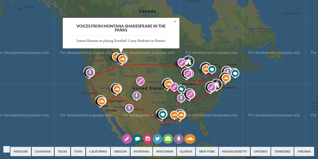
Compared to some of the other Shakespeare archive websites, the website design for Shakespeare on the Road is by far one of the most interesting. Shakespeare on the Road was an ambitious 2014 project where a group of Shakespeare devotees traveled around North America over the course of two moths to perform Shakespeare at 14 different festivals. The website seems to most focus on the cast and crew during the journey, highlighting their experiences and insights gained through performing at so many different festivals. The website also tries to push a rhetoric about the importance of learning and performing Shakespeare, and the design smartly condenses a lot of information into one main page. As for the rhetoric, the audience of the site seems to be directed towards people with an interest in Shakespeare, and specifically those in North America. Before entering the site, the first thing you see on the homepage is “SHAKESPEARE” in big letters. This lets the audience know right away what they’re getting into, with a sleek design and short but effective description of the project. While this site looks nice, however, the context of it isn’t so great. The lack of margins make the site feel way too spacious and open, and combined with the large amount of info at once made it somewhat frustrating and overwhelming to look through. I know that this is to account for people viewing on mobile, but for those of us viewing on computers this isn’t a very appealing design. The pictures they use and the categorical separation of articles make the site visually appealing and somewhat easy to navigate, but overall I found the design to just be way too complex. The interactive map, however, is a great idea. Not only does it provide the route of the road trip at a glance, but it lets the audience have a visualization of when and where the team was at the time something was posted. This provides a ton of context behind each post, and is a genius way to display all of the sites info at once. For our class project, I think we should avoid borrowing too much from this site’s layout, but most of the design choices, especially the map, I think we should try to take some inspiration from. When dealing with a lot of info, trying to come up with a concise, yet visually-appealing way to present it is key. The purpose of this site is clear: the team wants to represent their ambitious journey as best as they can, while also using it as a way to show the importance of learning Shakespeare. On the very first page, at the bottom, this is written, “60 DAYS. 14 FESTIVALS. 10,000 MILES. 38 PRODUCTIONS. HUNDREDS OF INTERVIEWS DISCOVERING WHY SHAKESPEARE MATTERS TO THE PEOPLE OF NORTH AMERICA.” This is essentially an overview of the entire site in 21 words, and is put in a spot that most people visiting the website won’t miss. For our class site, I think some form of tag line or condensed project summary on the first page would be a good idea. This gives whoever’s visiting the site for the first time more of a first impression of what the site represents. While this site design was probably commissioned by a professional, the content is somewhat diverse. There seems to have been a media team on the crew that put this together, but the site contains podcasts from different people, actor insights, photos, and more. This is a promotional site, but the authorship is diverse and genuine. I think that including some more personal content on our site would be a good idea, but not necessary. Finally, the genre of this site could be considered a quasi-blog. The content of the site is very blog-like, and can even be viewed chronologically, but it’s also a promotional site since its purpose is to spread the word about their project and their message. The website coordinators did a great job combining these two genres, and it would be interesting to see if we could incorporate multiple genres in our project. I think that this is a well-done site. There is a noticeable lack of content in some categories, as well, as some visual design flaws, but the overall design captures the ambition and purpose of the project quite well. For our class project, this would be a great site to take inspiration from.
4 Comments
Jack Tucker
9/18/2018 10:52:09 am
It sounds like you were able to pull a lot from looking deeper into this website. I agree about the overwhelmingness of some websites that have plenty of information, but no real emphasis. This post is super well organized as a rhetorical analysis and was easy for me as a reader to get a handle on the strengths and weaknesses that you gleaned from this website. Well done!
Molly Shea
9/18/2018 02:51:13 pm
Ethannnnn, I thought you did a great job on this rhetorical situation analysis, especially because you broke down each component we were asked to analyze while also tying in design elements. Even though I also analyzed Shakespeare on the Road, I learned some stuff from your post. For example, in your fourth paragraph, you quote the site's tagline -- that didn't even show up on my browser -- but I point that out because I agree that that could be something we incorporate into our Hamlet archive.
Ellen Barker
9/18/2018 08:21:16 pm
I like that you were able to find both positive and negative things about the website to talk about, since you acknowledged what went right and what could have been better. I also think it's really interesting that you compared the site to a blog; the idea of using two genres at once is potentially helpful to our project and is overall an interesting observation.
Sam Molli
9/23/2018 12:38:48 pm
Ethan, great analysis! I agree with your notion on the site being a little overwhelming, it feels a little in your face. I also think your idea about trying to include something like that map on our site was a good one, that would be a sweet feature. Leave a Reply. |
AuthorWrite something about yourself. No need to be fancy, just an overview. Archives
October 2018
Categories |
 RSS Feed
